Welcome to the Stock chart training section.
I want to make this section short and sweet. Too many people starting off in penny stocks try to over complicate everything and they end up going nowhere.
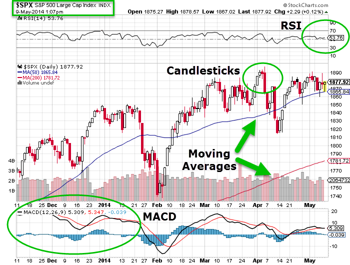
For penny stocks, I prefer to use Candlestick charts. I use stockcharts.com for a lot of charts. If I can’t find an OTC chart there then OTCMarkets.com is great for charts as well. Below is a basic chart with some of key indicators listed.
Candlestick charts allow you to keep it simple with resistance and support.
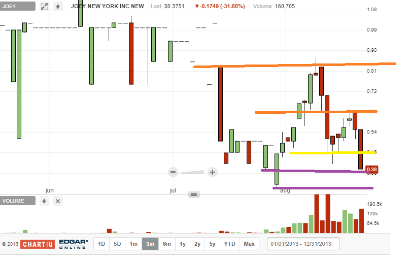
In the example above I have highlighted some key areas of resistance and support. Support offers support for a chart. It usually means it will take extra selling to make a stock go lower. Resistance is the opposite it is a roof a stock will have to break through in order to go higher. When resistance breaks and a chart goes up the resistance usually becomes a new level of support. Likewise, When a stock price falls through levels of support it usually becomes a level of resistance. The purple lines are support levels. The yellow line in minor resistance. The Orange lines are major resistance. If you follow the colored lines across you will see that they start off where prior resistance or support kicked in according to buying and selling action. Remember chart plays are all about recognizing a pattern.
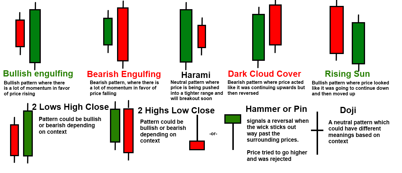
Closer Look at Stock Candles
Now let’s take a look at two popular chart patterns. The Death Cross(Bearish) and The Golden Cross (Bullish).
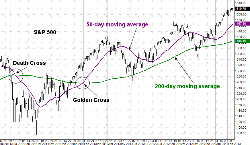
In this example, the chart starts off with a death cross and you see a major sell off after that. Then once it finds a bottom the stock price bounces and there is a Golden Cross. The Death Cross is when the short term moving average (50 day) falls below the long term moving average (200 day). The Golden Cross is when the short term moving average has an upward trend and cross the long term moving average. As you can see once the Golden Cross has confirmed the stock price goes up nicely. You can also see how the moving averages act as both support and resistance at times.
Here are a few more common chart patterns
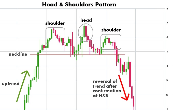
The Head and Shoulders is a common chart pattern to see. When you recognize this pattern you can make some quick profits trading it right.
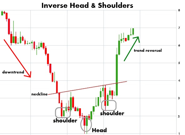
The inverse head and shoulders is the same pattern just flipped.
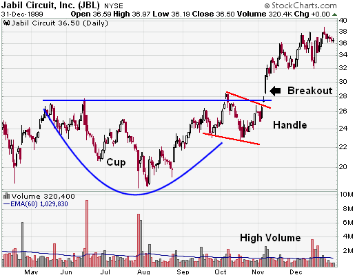
Another popular chart pattern is the Cup and Handle
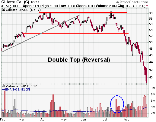
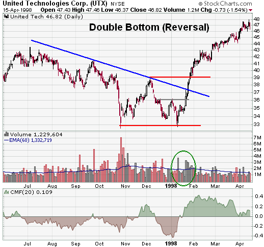
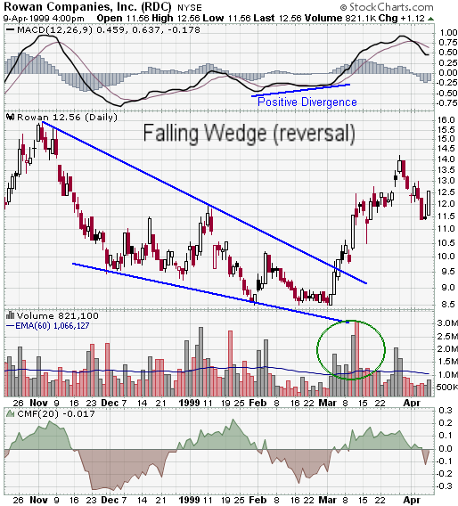
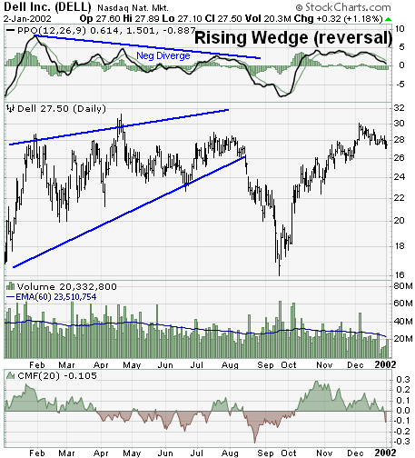
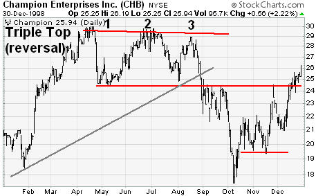
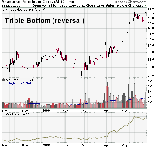
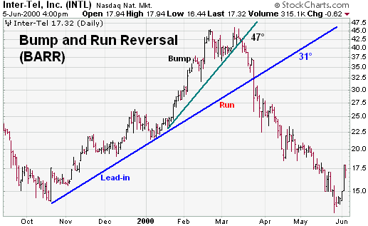
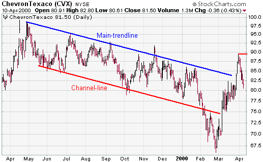
Here are a few chart reversal patterns
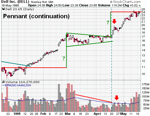
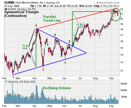
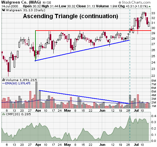
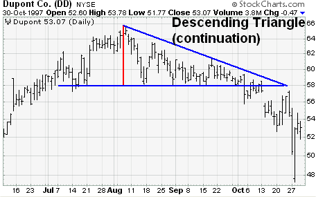
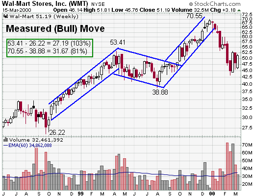
Here are a few continuation patterns
A lot of penny stocks, unfortunately, end up like the last pattern here the dead cat bounce.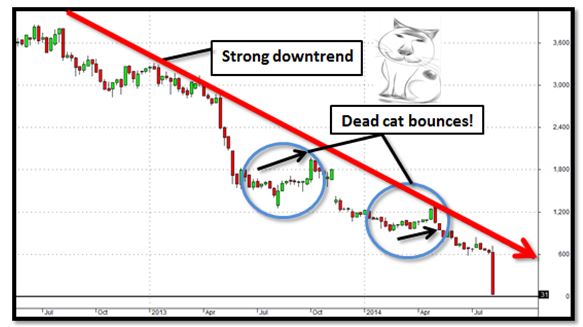
Hope you enjoyed! Please share and make sure you are on our email list and our text alerts list.